Do you lose the overview or drown in too much information when you brainstorm new ideas, solve problems or analyze data? Or are you just looking for a good approach to make sure this doesn’t happen? Then the Affinity Diagram is the technique for you.
What is it?
The Affinity Diagram technique helps to organize information (ideas, data, etc.) by visually grouping them into themes or categories.
How to use it
- Get together a team of people who have relevant information and insights for the topic of the session.
- Conduct a brainstorming on the topic or share pre-existing information that you want to organize during this session.
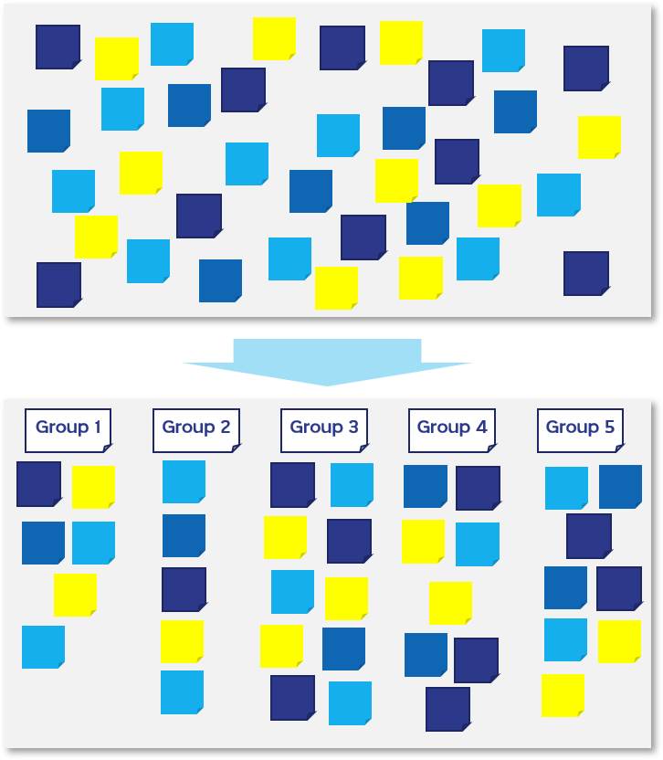
- Put the individual pieces of information (data, facts, drawings, ideas, issues, observations, etc.) onto (digital) post-it notes and put them up on a wall or (digital) white board.
- Start with one post-it and make it the first post-it in the first group on another part of the wall.
- Take the next post-it and if it is similar to the first one, place it in the first group. If not, create a new group.
- Continue to do this for all the post-its, placing similar ideas together and creating new groups when ideas do not fit into an existing cluster.
- You may want to break up larger groups into subgroups or combine smaller groups that are related.
- Give the groups names to help you create an information structure and discover themes.
Once completed, the affinity diagram may be used to create a cause and effect diagram to understand root causes or use the action priority matrix to determine which groups or items are the most important.
Feel free to contact us with any questions. We are also available to facilitate a (digital) session with your team using the Affinity Diagram.